
Bio Patrice de Santa Coloma, peintre abstrait contemporain
Methodology
Artistic practice
I define myself as an abstract landscape painter and colorist. Driven by colour theory and research, my palette has evolved from dark in my early works to bright and saturated colors in my latest series. After many years I suspect it is not the landscape that is the core subject, but it is more myself as a subject that becomes a landscape. As the french writer Pascal Quignard puts it: “je deviens le lieu” (I'm becoming the place)
Paths to abstraction
I have a daily drawing practice following life drawing classes in Paris and Bordeaux. I began painting portraits and landscapes in a conventional figurative way with oil and watercolours. My path to abstraction began by taking some things from the landscape and turning them into abstract shapes, like putting the backgrounds in the foreground and reversing the sky and the Earth. Flipping our visual perception of the world. Creating imbalance. Like Georg Baselitz would do with this portrait to detach the viewer from representation and tackle abstraction with his personal approach.
This idea came naturally from my practice in large-format photography where the image on the viewfinder appears upside down. A large-format camera is much like the human eye there is only one way to see the world and that is upside down. This is something that I do also in my paintings I start with the sky that I put below and the Earth above, which creates like a contrast, dark areas, dark patches and like mud, and falling down on earth from the sky-earth, which is now the sky. This idea lead me to produce the series Atlas
This creates a strange feeling and something not quite normal and that takes the viewer off balance in this traditional rendering of landscape. I deconstruct the traditional codes of the landscape and arrange them randomly. Sometimes I even cut plywood elements that I then paint.
This is reminiscent of my childhood interests in decalcomania, the rub-down transfers that I got from the nearby newsagent . This craft consists of rubbing the back of an acetate sheet with a ballpoint pen to transfer the images on a scenery landscape painted on a heavy paper and then folded in three parts. This became a scenery that could stand when opened like a theatre stage. I would place the characters on stage carefully. There was the moment when I lifted the sheet and revealed the image that was transferred by pressure. The transferred image had a glossy sheen that stood out against the matte paper of the background landscape. The characters sparkled with vivid colours that contrasted with the dull paper surface.
A vivid memory was the battle scene between cowboys and Indians with carriages and horse wagons, Indians and cowboys would be placed in a way I imagined. Many years later I came across a photograph of the American Civil War by Bernard George N., depicting the scene of General Mc. Pherson’s death. In retrospect It is a scene of multiple outcomes, it depicts a tragedy by not showing it explicitly. It shows and conveys an emotional response as the viewer depicts or reassembles a story that he makes his own exactly like in my perception of the decalcomania.
I later revisited this concept with my Titanes del ring that I watched during my childhood in Argentina starring: Martin Karadijian, el Caballero Rojo and la Momia. The show was inspired by the Mexican lucha libre but made for kids where each character was parodic (Pepino the Pope the Businessman etc.). The show was gory with fake blood and scenes of violence and terror that had a lot of impact on me.
In this early series my portraits consisted of Lucha Libre masks and wrestlers fighting in dark surroundings and dimly lit areas.
The series slowly shifted to present more of these shadows and light transitional studies and my research led me to the Rincones series that depicted the geometry of the corners. Three axes, four planes intersecting: floor, ceiling, left and right wall. In the centre, a vertical line. A corner that splits the composition in two. These 4 planes having distinct value renderings something that Edward Hooper was a master of or even masterly achieved by Vilhelm Hammershøi And the way Francis Bacon would delimit his sceneries or even Edgar Degas in his approach to composition by creating strong separation.
Large scale work
I produce large-scale abstract paintings evocative of nature. Landscapes, organic, symbiotic forms linked to their molecular biological structures organic and mineral. Most of which produced as improvisations around forms and colors that I develop and project on large canvases of up to 4 m x 4 m or even more like 2 m height by 10 m in length. The large work are immersive and colourful
Palette evolution
In my early works my palette was darker. Toned down, blacks and dark blues dominated. There was a search of contrast by blocking areas with masses of charcoal in the traditional chiaroscuro of the Renaissance masters. I used to leave charcoal patches or rough sketches below the paint film that appeared by transparency below the paint film, sometimes even adding charcoal to create dark areas or strokes above the paint film. The charcoal had a dark matte aspect that contrasted with the sheen of the oil paint. It created an area that absorbed light. I explored these contrasts on the surface of the canvas by using different mediums to affect the paint film like turpentine, Venetian balm, resins, egg and bees wax to alter the paint finish between matte and glossy areas. These transitions in the paintings lead me to experiment with gold gilding experimenting highly reflective areas on the canvas like in my Giotto series Campaniles and the San Francis Stigmata. In these series I also use gouache for a matte rendering.
Links with literature
yo también pienso en usted
El Tunel, Ernesto Sabato, Sous La Tente, Bordeaux, 2016
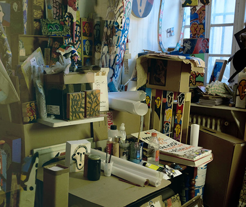
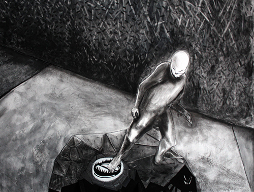
In short, the project was to imagine an artistic production based on the fictional character of Juan Pablo Castel. Locked up in jail for his crime, he creates muted paintings using black and white with scarce colors. All these productions were presented for the exhibition “yo también pienso en usted” moi aussi je pense a vous (sentence written on a scrap of paper by Maria for Juan Pablo)
- A text written by Catherine Pomparat around the exhibition. Extract: « Moi aussi je pense à vous ». Le titre opératoire était dans l’attente d’une réversion. Deux ateliers séparés par une fenêtre vitrée faisaient tourner sans arrêt un petit tableau à deux faces.[...] Full text (in french)
- A text written by the exhibition host Christophe Massé. Extract: “inventaire pour dire qu’au-delà des rêves obscurs que nous faisons se tisse une amitié liée à des interventions/intentions en compagnie de nous. Dos à dos dans le miroir. Certains êtres autorisent le rapprochement, d’autres s’esquissent, encore d’autres s’esquivent après le diner. J’en fais, je pense les frais et je pense aussi ; ma joie. Qu’elle demeure ! Lutter est le point Oméga qui me/nous rassemble. Patrice sème. Je crois s’aimer est indispensable sans rien n’inventer : ni poudre, ni fil, ni roue. ” full text here (in french)
- Some of the works produced by Juan Pablo Castel during the solo show at Sous la tente (Bordeaux)
- Casa Tomada, Julio Cortazar was the narrative behind the solo exhibition Interstices (2014) hosted by the gallery Rezdechaussee
- Article (in french) on rue89 by Valerie Champigny on the Interstices solo exhibition
Cuentos de Locura, Amor y Muerte
Horacio Quiroga, Los Enlaces, Espace 29, Bordeaux, 2013
Paul Auster, Moon Palace && Ray Bradbury The Martian Chronicles && The Omega Man
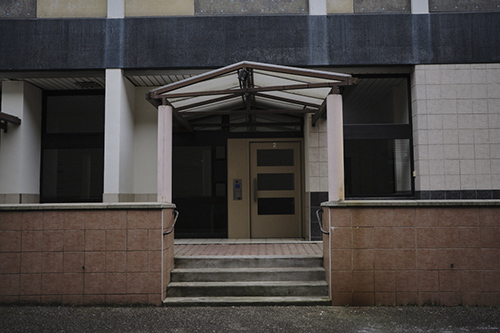
- Ray Bradbury tribute: Meriadek Chronicles I
- Meriadek Chronicles II,
- Meriadek Chronicles III
- Paul Auster, Moon Palace
Homere, The Odyssey
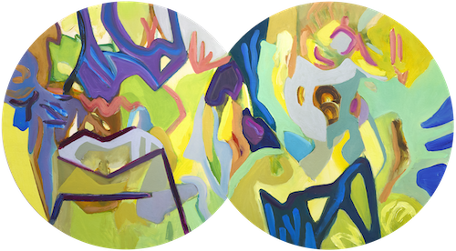
The panels explore the phenomenon of binocular vision: the way our two eyes perceive slightly different images of the same scene, which the brain subsequently combines into a single, unified perception.
This process of convergence is translated into a sequence of circular and interconnected forms. At certain stages, two circular fields appear side by side, suggesting the separate images received by each eye. As the sequence develops, these two fields progressively merge, eventually forming a single visual composition. An important feature of the construction is that what may appear to be two separate discs is, in fact, sometimes a single piece of wood. The double-lobed silhouettes are precisely laser-cut from one continuous wooden panel, physically joining the two visual fields.
Each surface is individually painted in oil, with an intricate interplay of vivid colours, abstract signs, graphic gestures and geometric shapes. The paintings are not illustrations of an optical phenomenon but autonomous pictorial compositions that investigate the relationship between separation, overlap, fusion and unity.
Together, the panels form a visual sequence in which two perceptions gradually become one.
Drawing, sketching, doodling, colour and geometrice exploration, chromatic Studies, shape Play, colour compositions
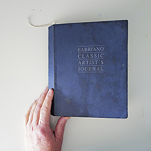
I have a continuous pictorial exploration unfolding within sketchbooks. A daily practice of recording signs, laying out colours and developing patterns. Every morning I seat in front of the drawing board and grab whatever tools and colors are in front of me: watercolours, coloured pencils, fountain pens, quill pens,inks, markers etc. I lay down graphical signs, colours page after page as a journal in a Fabriano Artist Journal that takes me year more or less to finish. I started in 2009 and each year a journal is added on the shelve.
Logging these graphical "thoughts" every day help me to follow a progression. I revisit some pages, some forms or patterns emerge, some colours. All these experiments will eventually be used as a base pattern or idea that I'll explore, push further on larger scale on paper or canvase.
Pigments, materials, research, old masters receipes, pre-columbian pigments
In my practise I was more interested by the question "what do you paint with?" than "what do you paint for?". The question also evolved to "what did the old master use as their materials?" and the colors formulaes before they were produced by the industry.
I followed the receipes of Cennino Cenini in Il Libro dell'Arte , Xavier de Langlais, la Technique de la peinture à l'huile and The Artist's Handbook of Materials and Technique by Ralph Mayer
With a strong interest in colour theory and colours in history the writings of Michel Pastoureau and more on color theory books such as Joahnes Itten's "The Art of Color: The Subjective Experience and Objective Rationale of Color", Michel-Eugène Chevreul’s De la loi du contraste simultané des couleurs (1839).
Some series make extensive use of particularly pure (cobalts, cadmium, lead, vanadium and oxides) rare and expensive pigments and metals such as gold, white gold and rose gold (gilding on linen or cotton canvases):
- The Pareidolia series (2026) uses cadmium red, cadmium yellow lemon and cadmium yellow deep extensively.
- The Olympia series (2016) (dimensions 95 cm x 130 cm and 130 cm x 95 cm) consists of 5 paintings painted with a combination of blues such as cobalt blue deep (PB 74), genuine cerulean blue, French ultramarine and emerald greens.
- Some of the paintings use non industrial red oxide (the Blockxx natural red oxide less pure but has a more natural feel). This red oxyde is present on my palette as my Indian Red (PR 101 not to be confused with the PR 102)
- Green chromium oxide. Used extensively for mixing grays in most of my paintings.
- Rinman green (PG19). A late addition to my palette. Rinman green is a cobalt green that is extremely luminous (Schmincke formulation as 'oriental green') and grittier coarser, has a more turquoise aspect (in the Hold Holland formulation 'cobalt turquoise'). Both formulations are interesting and very different from one manufacturer to the other due to their grinding and other processes.
I usually prefer to use zinc white as opposed to titanium. I also use lead white (from Old Holland sealed in a special tin jar for safety as lead is highly poisonous). There are multiple reasons for not using titanium as it is the most unnatural white and has an industrial artificial brightness that weakens the other pigments in the mix. It contaminates most of the colors when mixed with it and brings an overall dulness to the painting. Zinc has a cooler shade and is more transparent. Most important it does not weaken the other pigments when mixed with it. Lead white is warmer and more opaque. A lot of manufacturers such as Michael Harding propose different whites. Whites are essential in the palette as it is often mixed for other pigments to get the desired colors nuances.
- San Francis receiving the Stigmata is a free contemporary interpretation of the Giotto wood panel of the same name (1300 AD) found in the Louvre museum. It is a large scale painting (190 x 300 cm) on raw linen prepared with hide glue with gouache highlights and zinc white pastel (Blockx is the only manufacturer to have zinc pastels to my knowledge) drawing to represent the Saint. His aura has a thin ring of gilded yellow gold 18k with white and ultramarine gouache. The symbolic 5 rays emanating from the cherubin angel hitting the saint is white gold gilded. The gouache used are of utmost quality the same ones used by Henry Matisse (Linel range by Lefranc Bourgeois)
- The Giotto campaniles consists of three paintings made with egg tempera mixed with three different whites: zinc, lead and lithopone. The research idea was to expose the paintings to a strong U.V. light to see any shift or degradation of the paint film. FACTS project with the Proteome Platform of Bordeaux each painting has the same dimension (195 x 150 cm) and present a central disc painted with egg tempera one painting with zinc, lead and titanium. Each circle is constrained / outlined by 3 cm structure evocative of a house / campanile (such as a kid would draw a rectangle with a triangle on top). This strips are either gilded with real gold (rose gold, white gold or yellow gold) so as to catch and reflect the light as gold ornaments in churches.
- Gouache was also used with a palette inspired by the Trecento renaissance palette. These works are part of the FACTS project residency with the University of Bordeaux that was held in 2018. The paintings were exposed during the solo show: Primitivi held at the Glacieres in Bordeaux in 2024
Gouache was also used to tone the paper marouflaged on canvase for the large scale drawings
Pigments & Colours research
The following short texts relate how I came accross some special colours. How they came into my palette and how they influenced my work and approach to painting. This palette is in constant evolution as I came recently accross some new pigments during a residency in Mexico (San Luis Potosí) with the Mayan blue (indigo) and cochineal red that I prepared as part of my reseach for the project around the Aztec codices Whites (lead, zinc, lithopone) were also experimented with during another residency: "Les peintures discretes, les secrets révélés de la matière organique" A research project part of the Art and Science residency in partnership with the University of Bordeaux (FACTS program) and the Bordeaux Proteome Platform (CGFB)Hematite red PR102, PR101
This blood-red color is impossible to reproduce, even though iron oxide comes terribly close to it. Added in excess to oil, a brushstroke looks like a Fontana wound from which mixed blood and lymph would flow.
- This text was originaly published in the book Rien ne sera plus jamais vraiment tout à fait pareil
- Hematite red (full text in french) Hematite red
Cobalt Blue Deep PB74
My encounter with cobalt blue completely transformed my palette. So much so that today, I create paintings 'around' its unique hue. I darken it with madder lake or alizarin, give it dark coppery reflections using Prussian blue or ultramarine, let it slip toward turquoise when mixed with English or Veronese green, and soften it with cadmium orange. When I use it pure, it surpasses even the most intense reds and catches the eye without letting go.
- This text was originaly published in the book Rien ne sera plus jamais vraiment tout à fait pareil
- Cobalt blue (full text in french) Cobalt Blue Deep
Armour Green PG17
My earliest memory of colors is from the model airplanes I built with my father in Argentina when I was little. The colors organized in small pots fascinated me. I remember two models in particular: the British Spitfire and the American B-52 bomber. I would watch my father work. He would lay the fuselage parts out on newspaper. He painted the pieces carefully, which made empty shapes surrounded by green on the paper. We had to wait for it to dry, but I was impatient so I would get my fingers stained and leave fingerprints on the paint. I loved the smell of the solvent used to clean the brushes.
- This text was originaly published in the book Rien ne sera plus jamais vraiment tout à fait pareil
- Armour green (full text in french) Armour green
Zinc white PW4 and Lead white PW1
White is essential on my palette. This is the color I use the most in my searches for shades. It gives its character to the whole picture. I definitely have banished titanium because it weakens mixtures; too industrial, too powerful, too covering. Zinc is more subtle to dose, it preserves the intensity of the pigments in the mixtures. I use it with lead white to get a little more dullness and covering power.
- This text was originaly published in the book Rien ne sera plus jamais vraiment tout à fait pareil
- Zinc white (full text in french) Zinc white
Yellow bismuth vanadate PY184
Exalted color, a roundness almost arrogant in its clarity. It dreams itself Icarus, or Helios connects us to the immaterial, spiritual, elusive white—so very difficult to bring into my forms. It grows even stronger when it is surrounded by or contains white; next to violet, purple, or blue, it begins to vibrate violently. Bonnard and his Boxer, that bruised head with arms flailing in the air at the end of suffering, the figure blinded by the light of the blows. It is a yellow, or a mixture of yellows, that overwhelmed me with its dazzling intensity. The small size of the painting also seems to play a large part in this. Too small to contain all that violence.
- This text was originaly published in the book Rien ne sera plus jamais vraiment tout à fait pareil
- yellow bismuth vanadate (full text in french) Yellow Bismuth Vanadate
Social
About
news bio / contact